How To Buy A Country
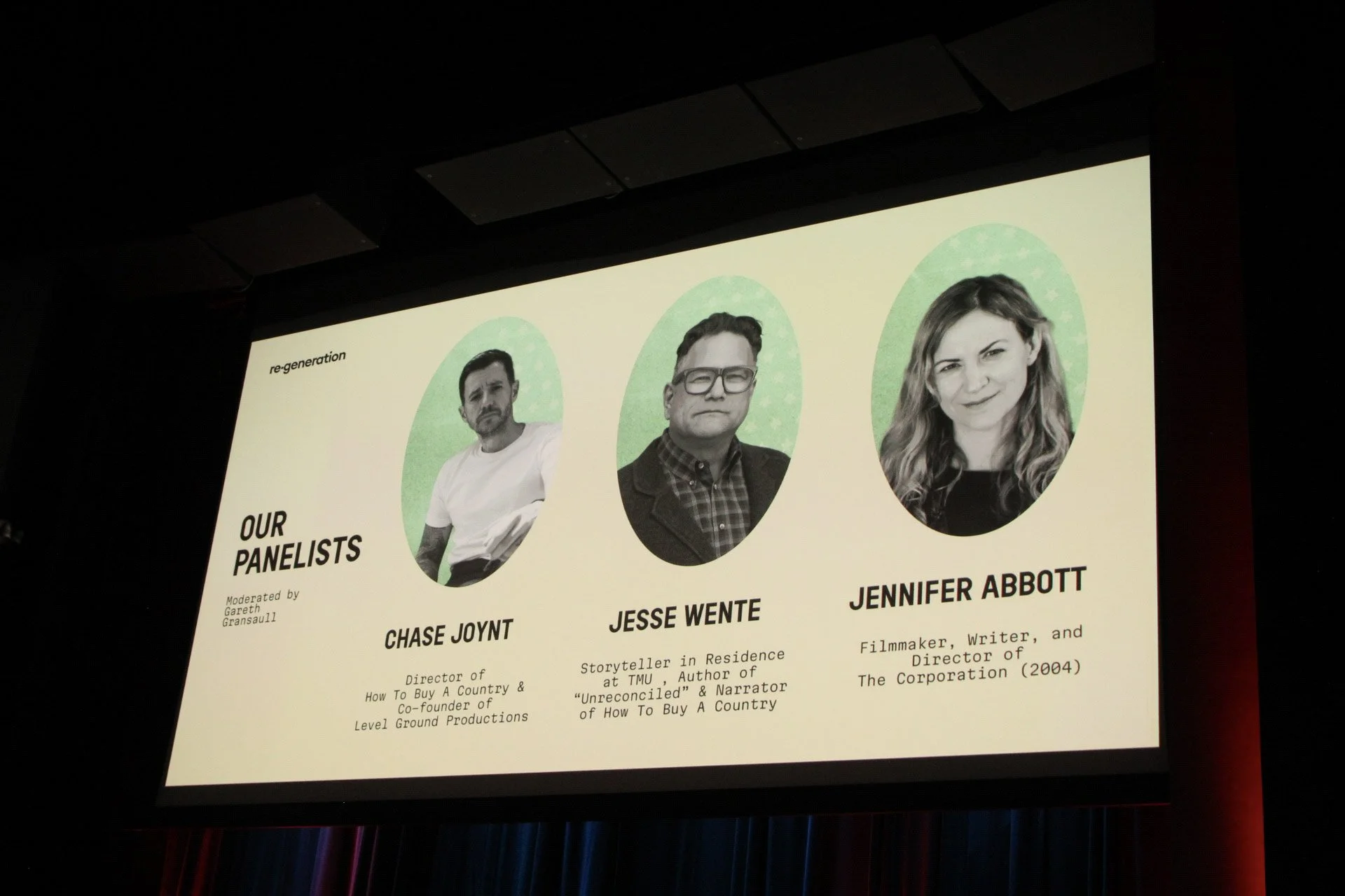
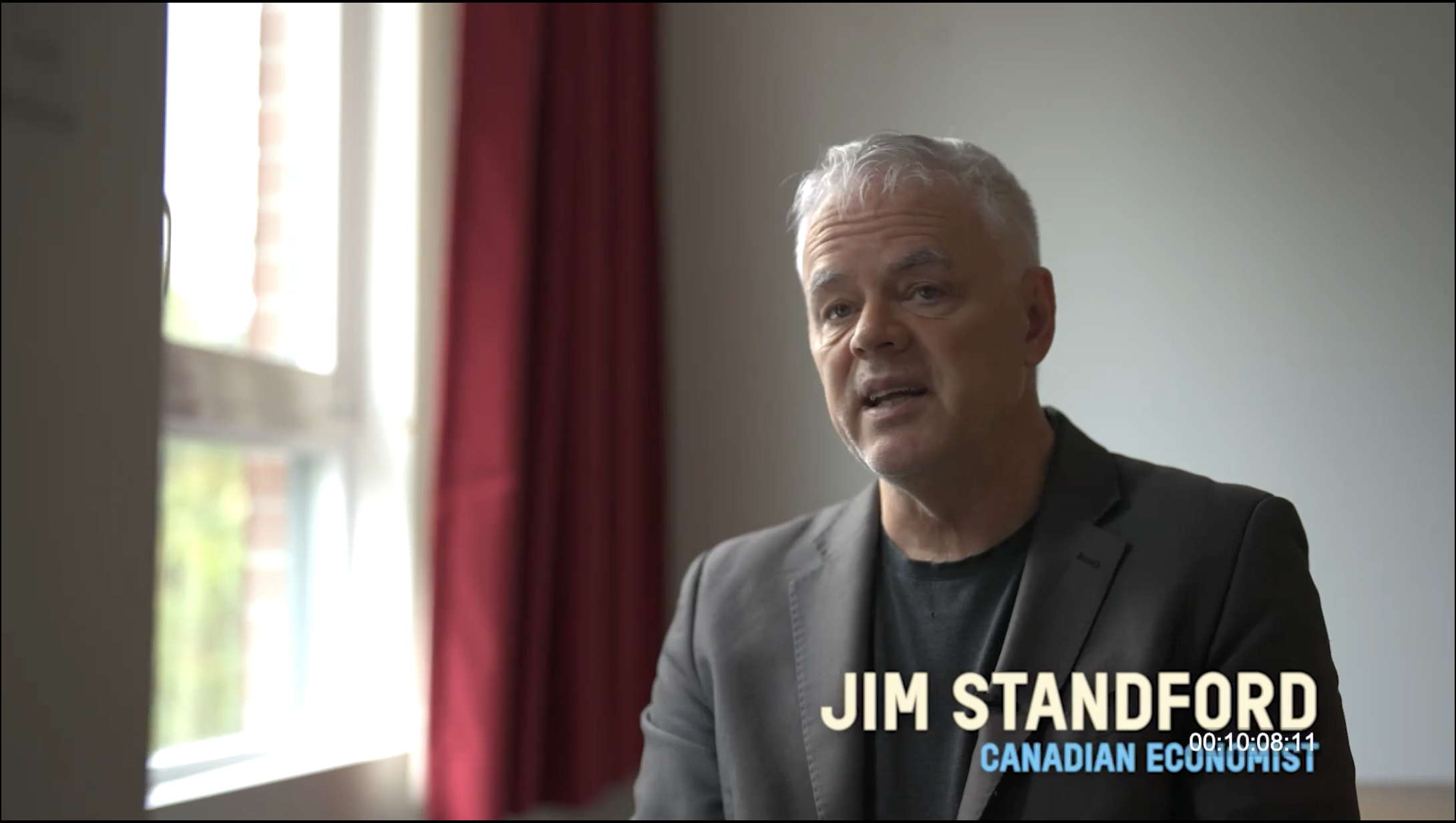
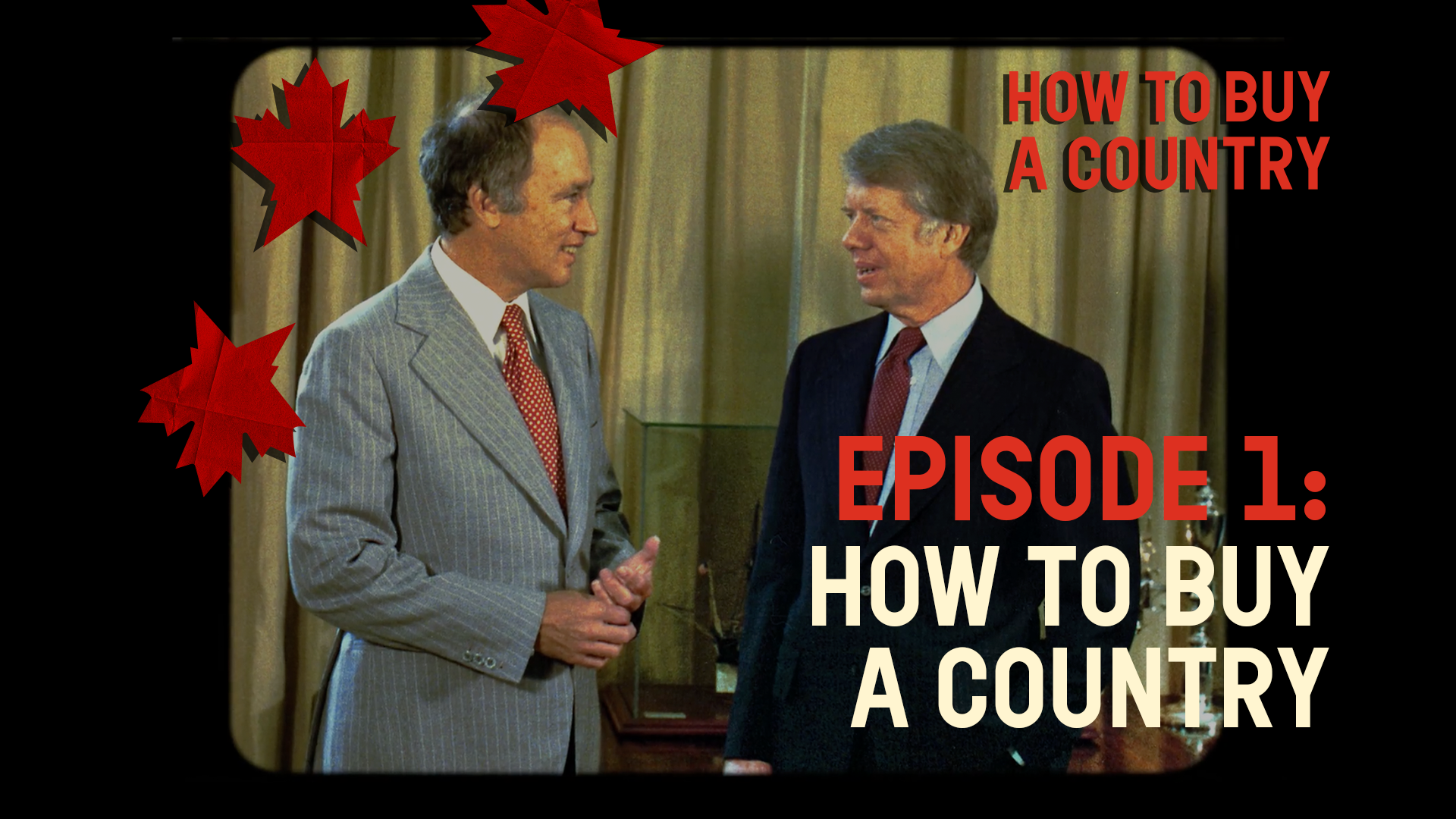
How To Buy A Country is a 4-part docuseries exploring trade relations between the U.S. & Canada from the golden years to the tariff wars of today. It is a nationalist-populist project that interrogates Canadian identity within the global system that is underpinned by American dominance. It was made in collaboration with re•generation and award-winning production company (known best for it’s documentary on the Amazon union-workers, UNION (2024)) Level Ground Productions. My credit on this project is Executive Producer and Design Director. I was responsible for the visual identity of this project.
Continue reading to learn more about the strategy behind the design of this project.
VISUAL IDENTITY

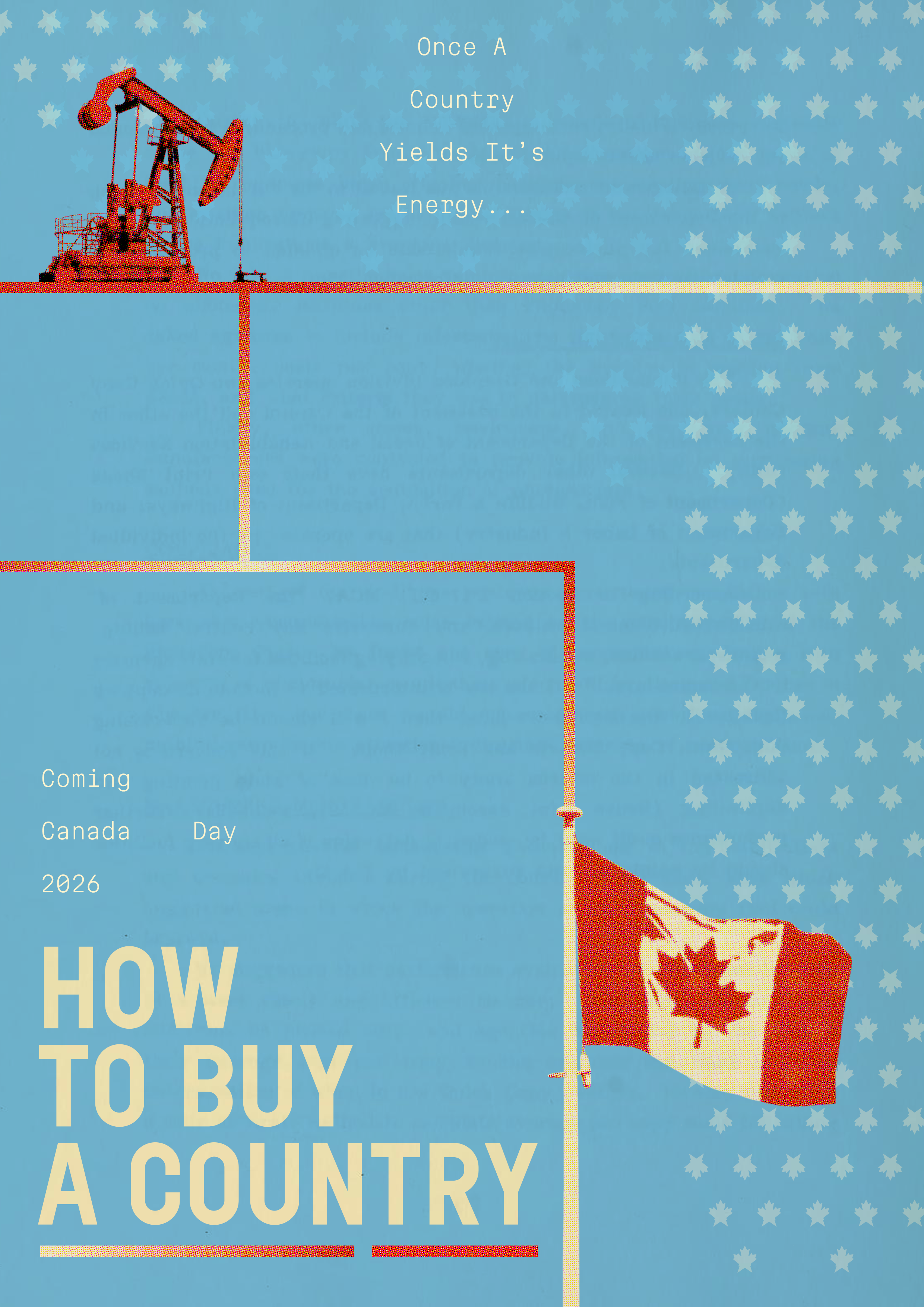
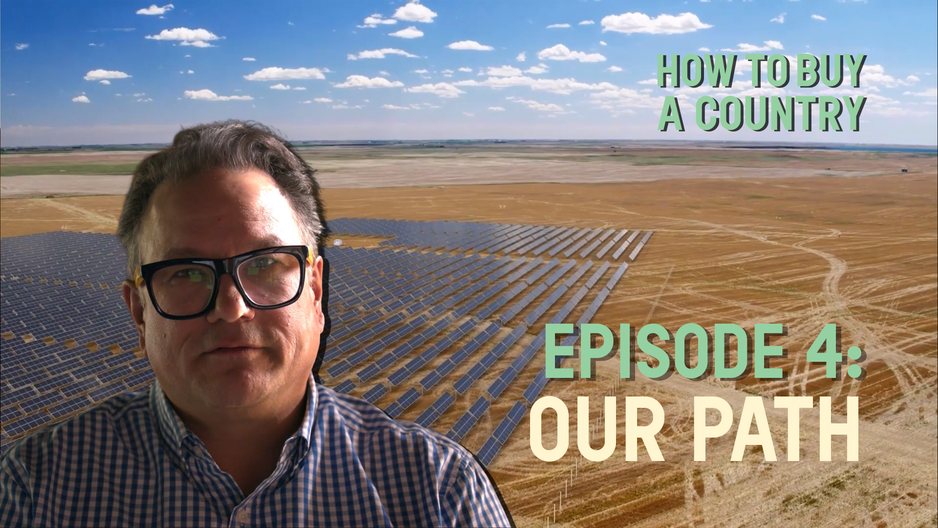
How To Buy A Country begins with the Reglo Font style that I found on an open foundry. This entire project is not monetized and we aim to make it accessible to anyone and everyone with internet-access. The main font being sourced from an open foundry felt symbolic to that. I wanted something bold, because I knew there would be some great taglines and nobody should miss them. Reglo, although bold and unmistakable, is slender, which reminded me of vintage sans serif fonts which I kept coming across as I conducted research for this project.

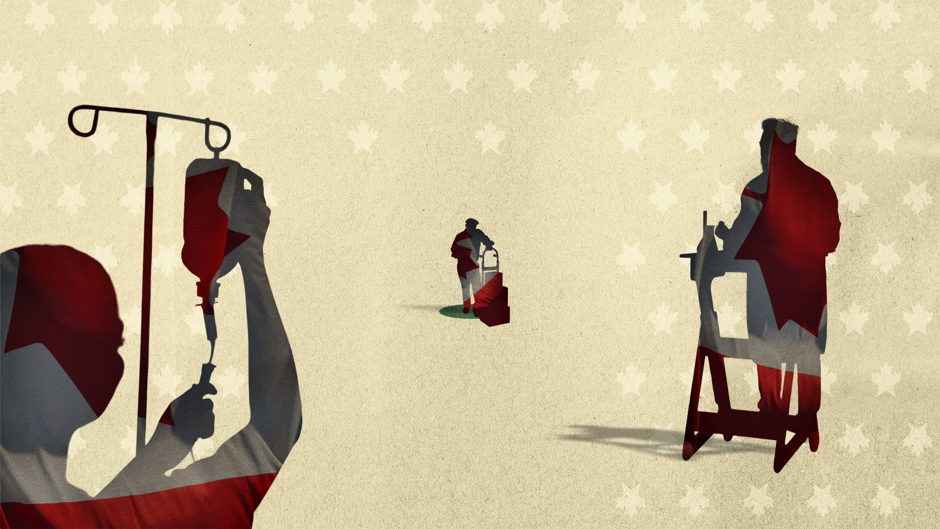
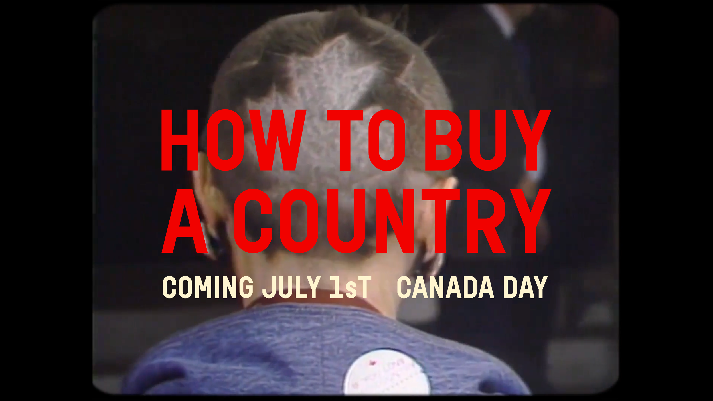
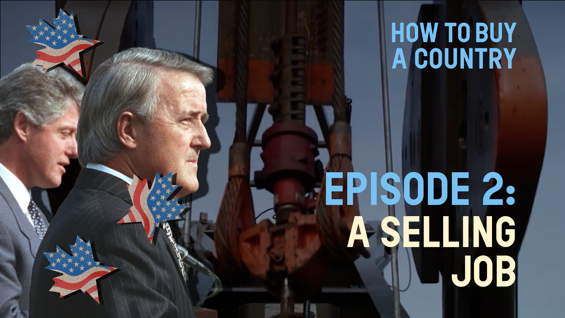
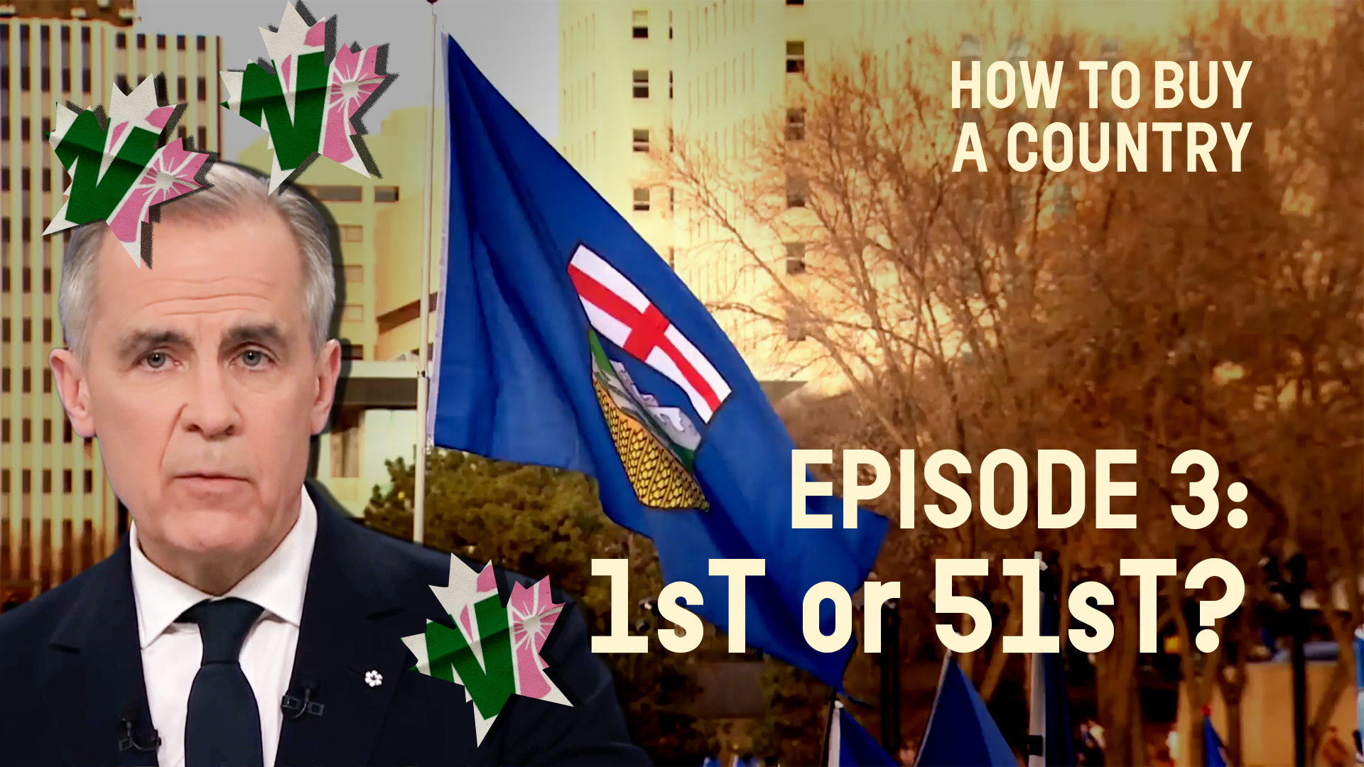
The starleaf is where things start to take shape. I wanted a repeatable motif so my first that was to create and interchanging pattern of stars and maple leafs. Those two things are such strong national symbols for Canada and the U.S. and instantly recognizable. Putting them side by side would be a visual representation of the central subject of the film, their relationship. However, visually, the pattern didn’t look right. I then got the idea of combining them. Which was the perfect new emblem for the core argument of the docuseries rather than the subject of it. From afar the starleaf is indiscernible, one minute it looks like a maple leaf, but if your squint it looks like a star. This represents the constant dilemma of Canadian identity, on one hand we are an independent sovereign nation, with it’s own history, but sometimes to the rest of the world, it seems as though we are undifferentiated from our neighbours to the South. Is this by design? Watch How to Buy a Country to find out.
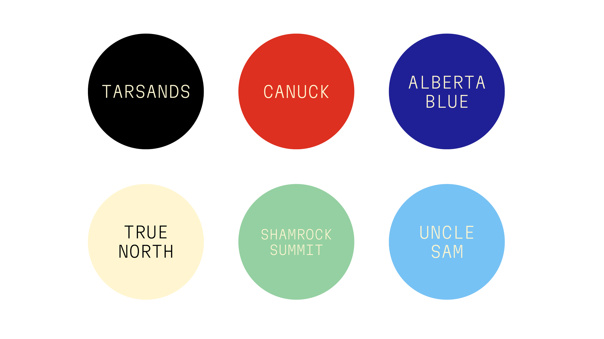
For any colour scheme the most important thing is a choosing a set that has enough to play with yet is restricted enough to create a very comprehensive visual language. Picking too many colours is always a burden, there’s no story behind it but people often do it so they don’t feel restricted. However, restrictions are necessary so you are motivated to remake a visual identity in endless forms.
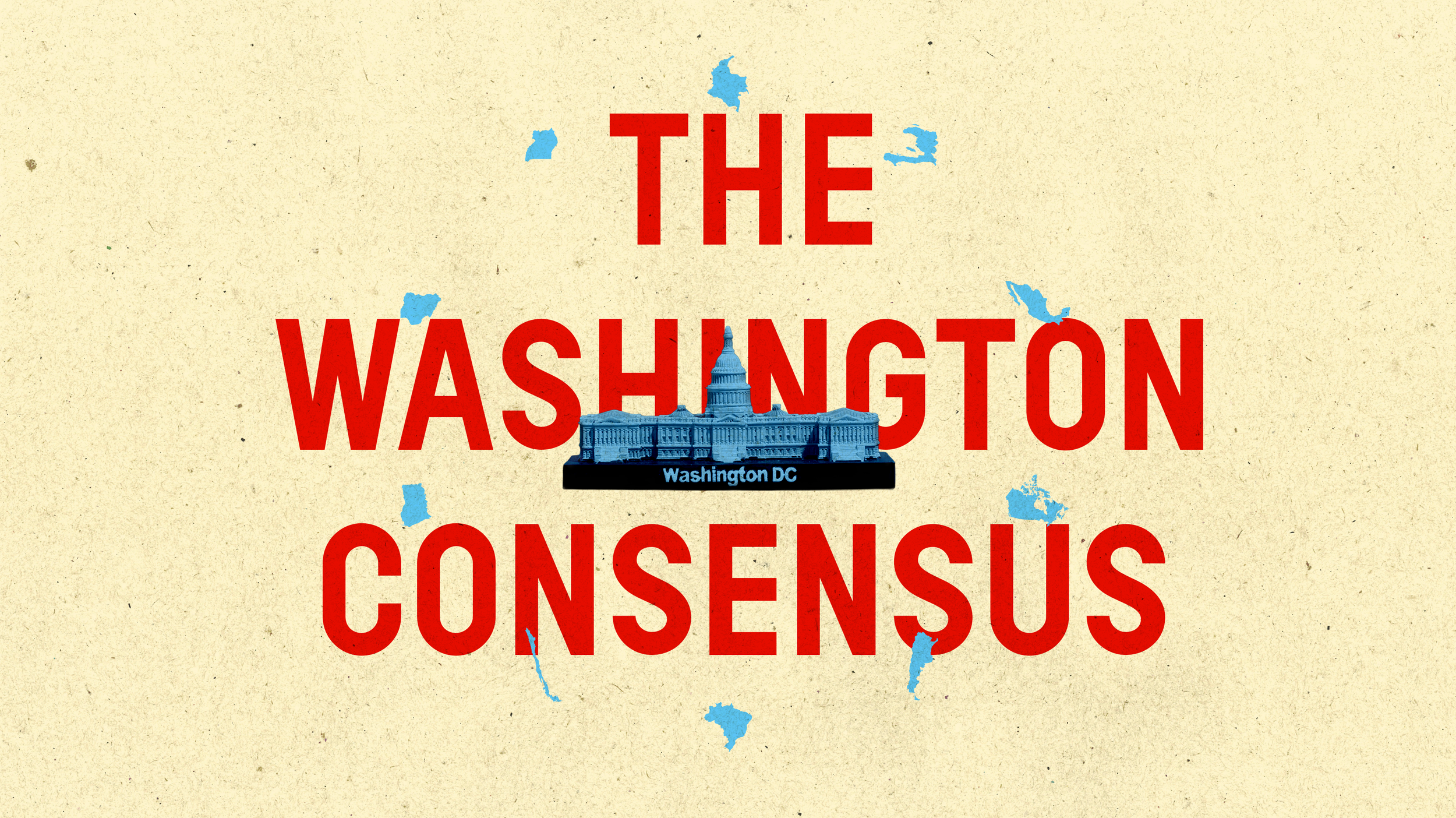
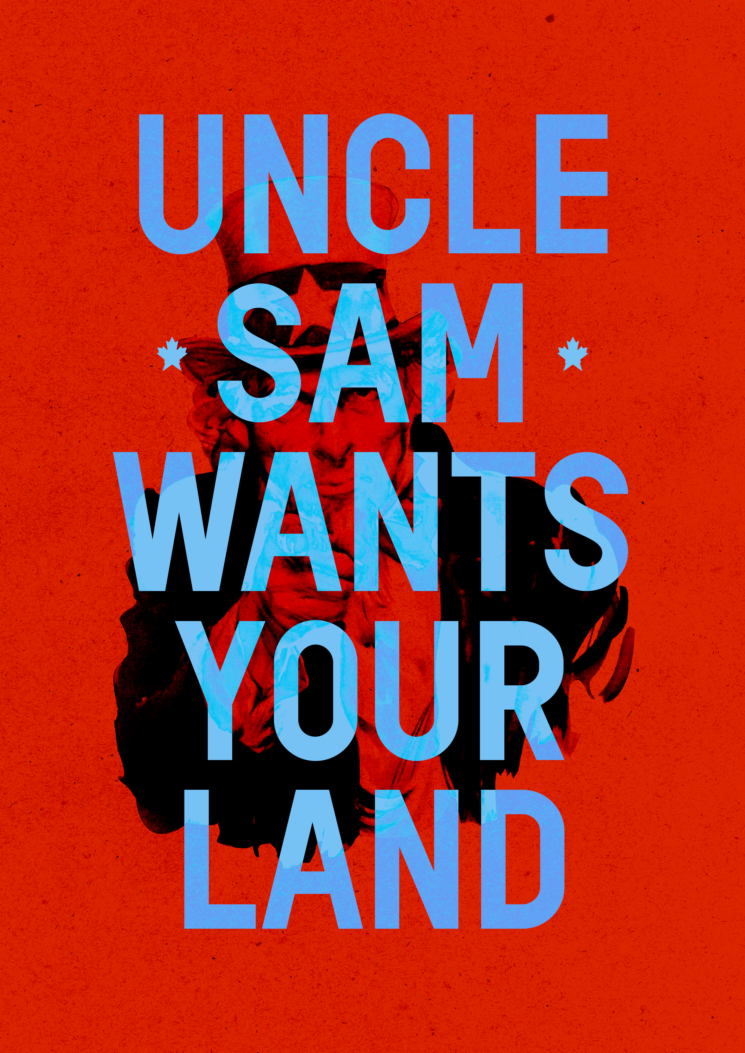
When choosing the colour scheme, we needed a white and a black for contrast. I went for an off-white almost yellow because this will be on screens and we don’t want to blind anyone. The black could have been dark blue, or dark green, but black is fitting for this project’s themes. I named it Tarsands, and the off-white is called True North, an ode to the Canadian national anthem. When picking the primary colours, the first thing that came into my head was red and blue for reasons that may not seem so obvious. I mainly thought of the red and blue pill in the matrix. The idea of two opposing paths is recurrent in the thesis of this project. Then it dawned on me that those are also national colours for both Canada and The U.S. They are also the colours of the two most prominent political parties in the U.S. and Canada. Red and blue is so politically charged it’s hard to envision this project without those two colours. You will notice there are two different blues, a deep and a sky. I wanted different blue hues to play more with the American flag, which is coloured in differently in cartoons and caricatures. I thought of Bad Bunny’s constant use of the light blue Puerto Rican flag, the light representing a free and independent Puerto Rico. I thought of Cuba, and Haiti, and Chile and the Dominican Republic. This story touches on all of those countries. We have all been subject to globalization, the Washington Consensus, Monroe Doctrine and the firm grip of the U.S. Empire to varying degrees of intensity and tragedy. Blue and red are the colours of America (north, central, & south). And in part to be American is to have Uncle Sam at your doorstep, threatening to kick it down at any given moment, that’s why I named the sky blue Uncle Sam.
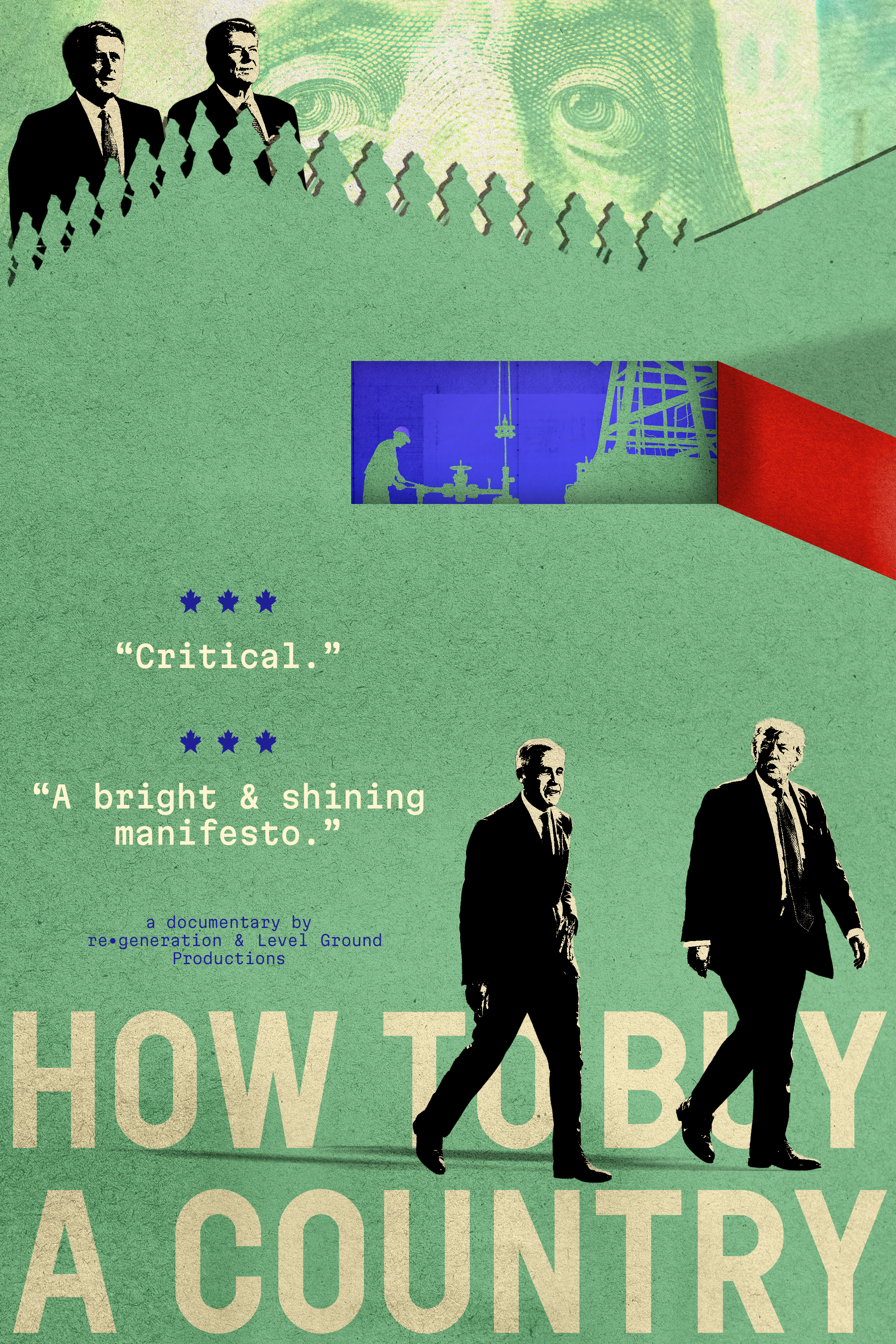
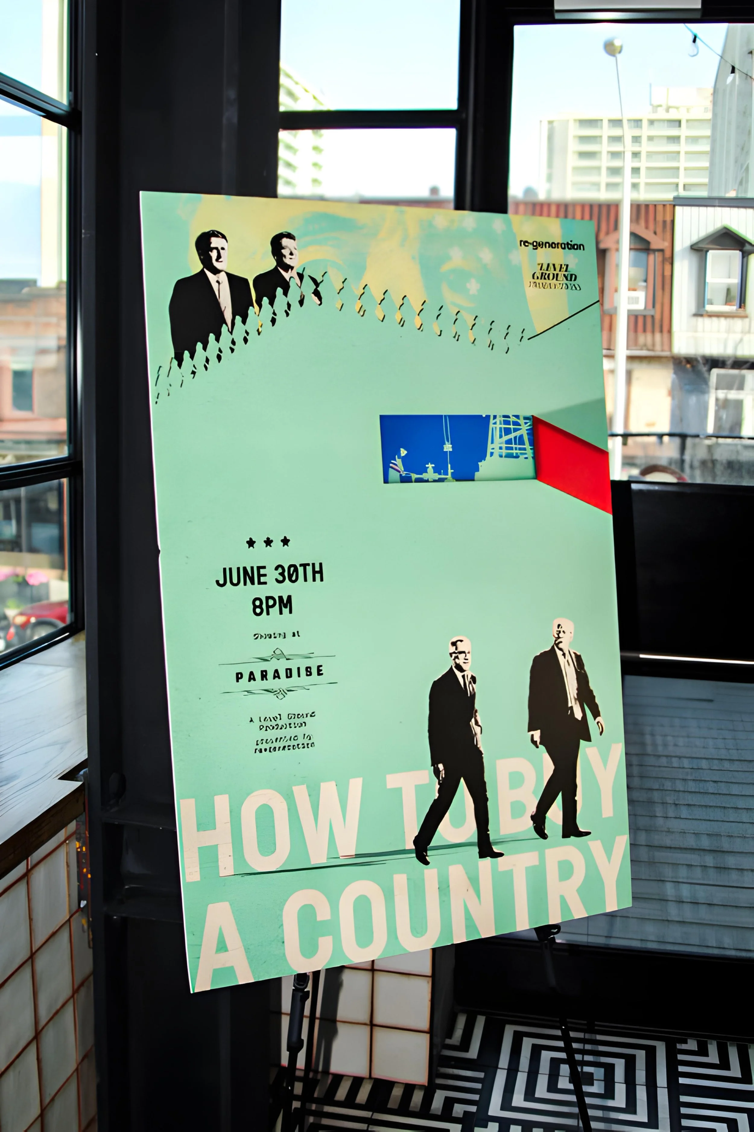
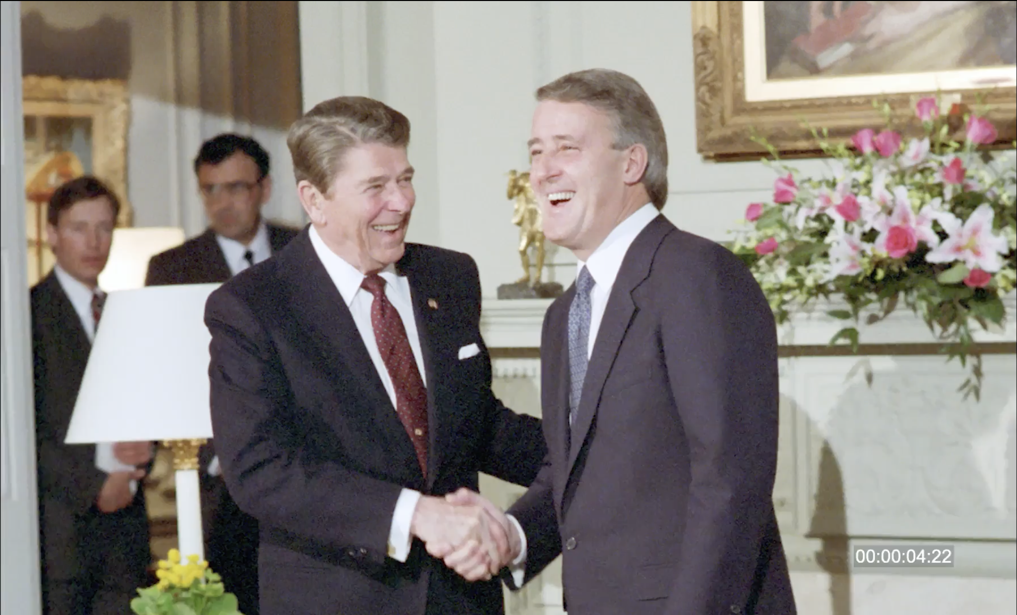
But the deep blue, almost royal blue is similar to the blue found on the Albertan flag, which is a place we dive into in this project. I called it Alberta Blue. Red is uniquely Canadian, so Canuck seemed only right. The green, my favourite, was added mostly because it looks so good with red (colour wheel people), and my initial intent wast to sprinkle in around a very blue and red rollout. It then turned out to be the main colour in our official poster, which was unexpected and perfect. It’s named Shamrock Summit, a very important place in this tale.
ART DIRECTION
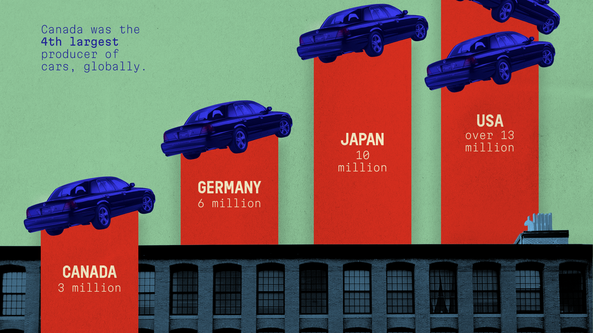
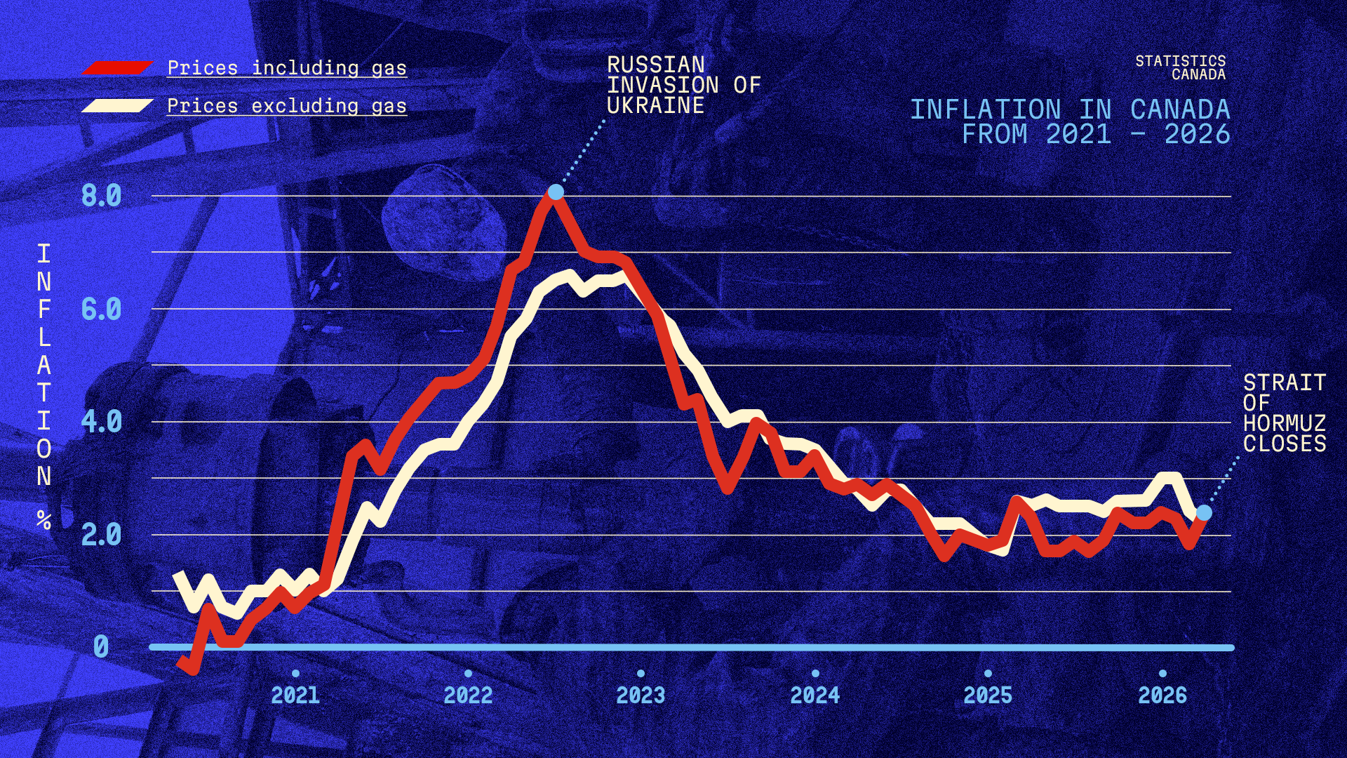
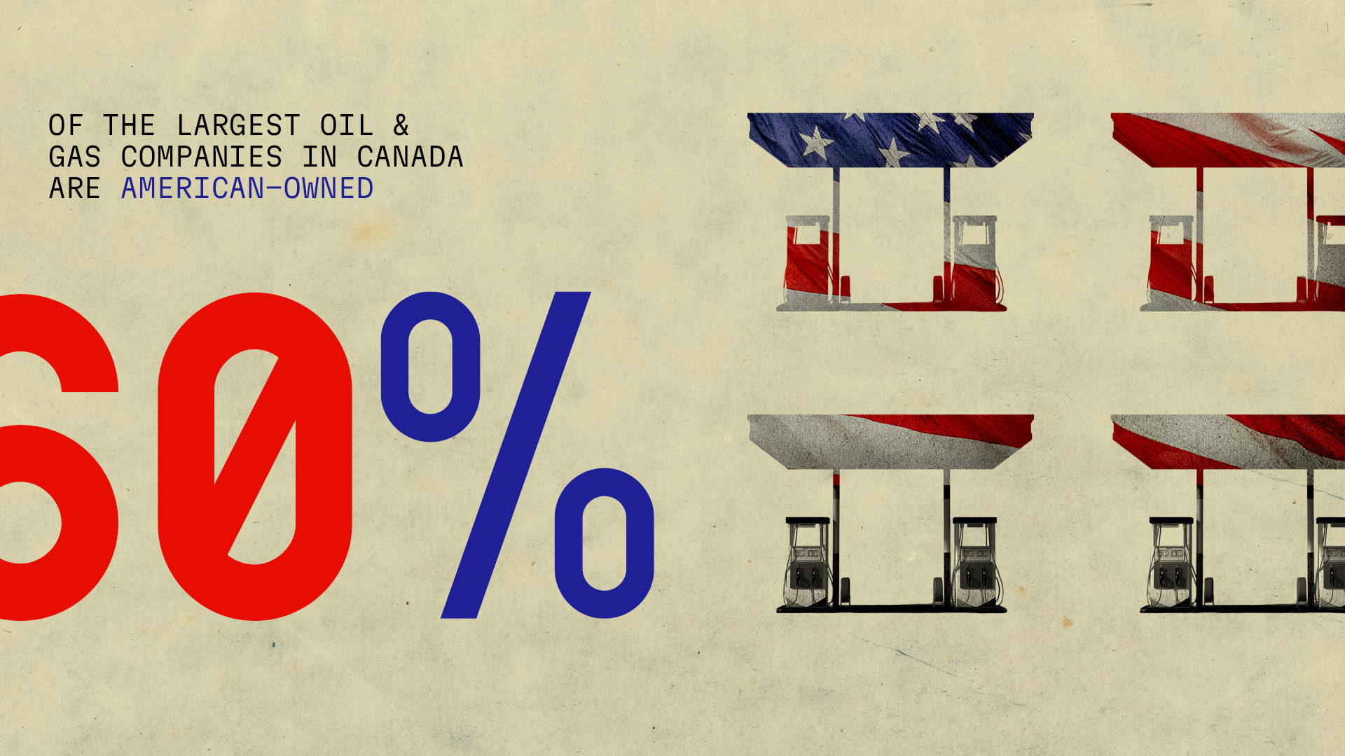
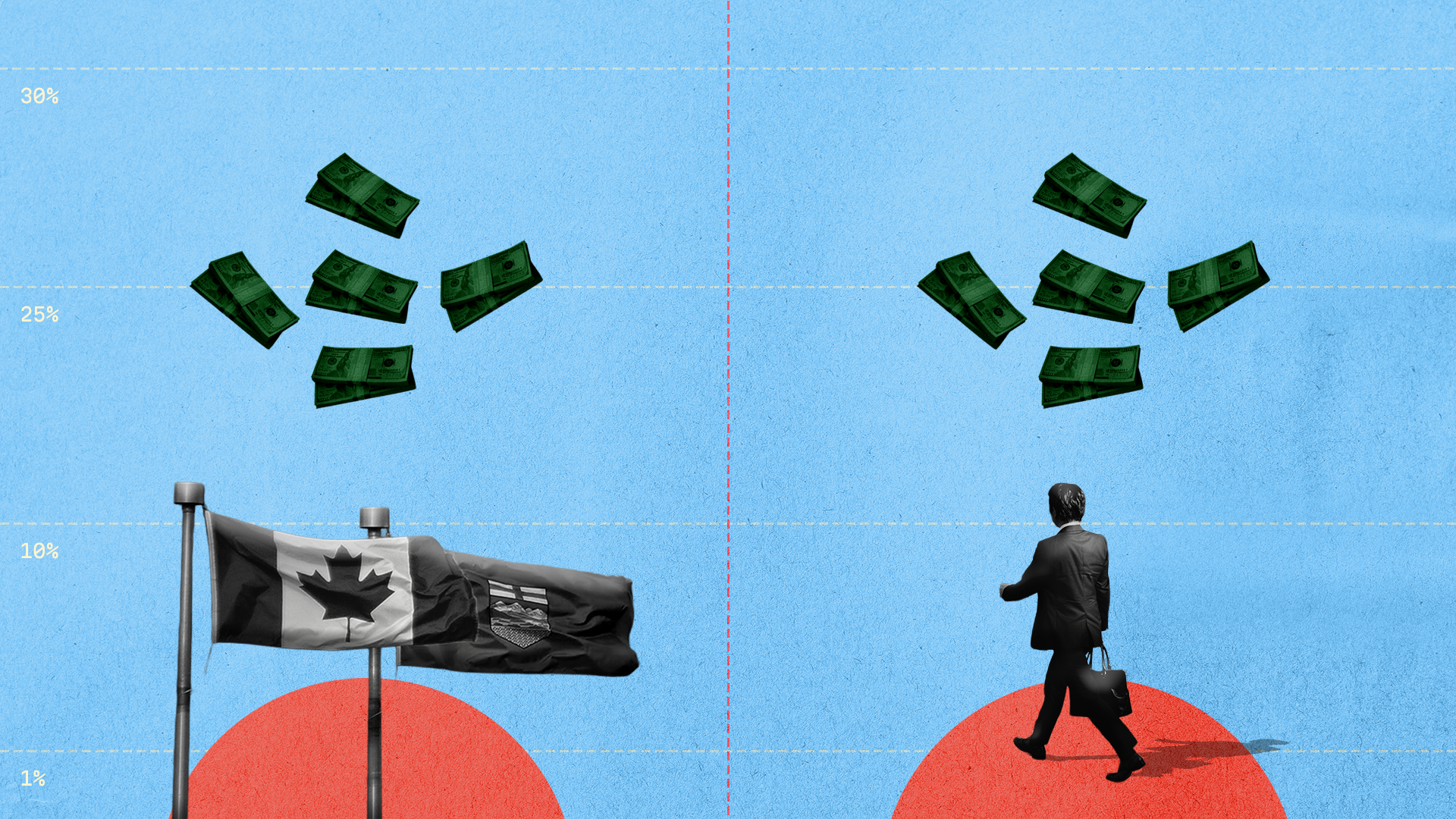
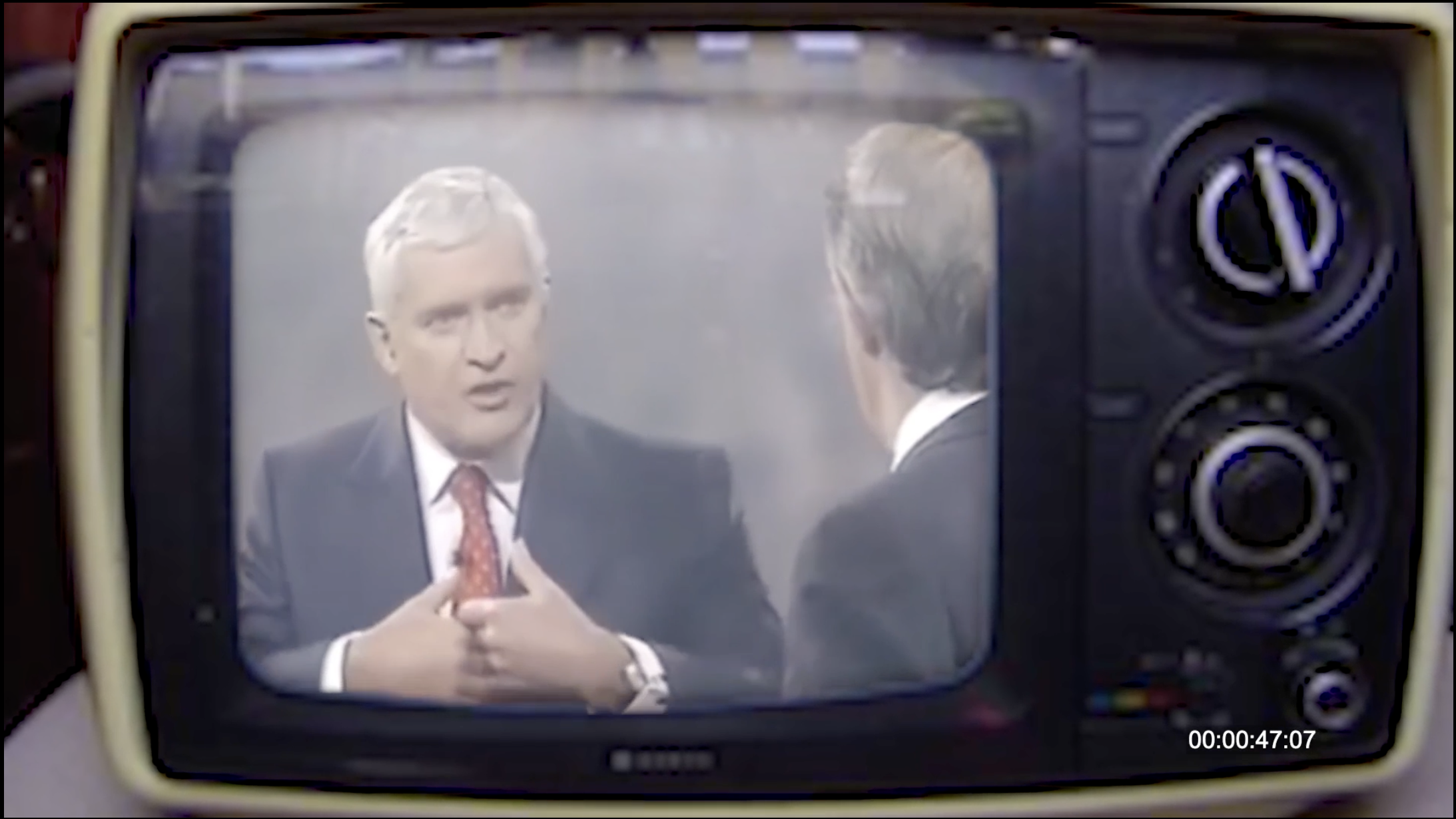
The colour choices were intentional. I wanted a blue and red, a pure black and a white, and lastly a green for good measure. But why those shades? Contrast!!!!!! It was necessary for this project. A lot of the footage is archival, although many of the clips were coloured, the resolution quality left the palette a little muted. How could we break the audience out of the hypnotic trance of old footage. With candy apple glossy red of course. I mixed and matched effects. Duotone, black and white, pixelated, halftone, you name it I put it. I used different textures, from grain to concrete, to paper, to one that just looked like a bunch of oil smudges. My only goal was to have everything look rich and vibrant, and for the colours to interact in a way that made each of them stand out.